Residential Displacement
Context
We investigated ways others have measured displacement. Residential displacement – the involuntary residential mobility of an individual from their home – is difficult to measure, and there are different approaches from the literature. For example, some population-based approaches measure compositional changes in a neighborhood/geographic area, usually based on demographic variables such as income or race. The loss in population across these demographic categories is an indicator of displacement. A limitation of these measures is that actual mobility is not traced; thus, one cannot be sure if the loss in population across the demographic category are due to households leaving an area or a change in the demographic variable itself (e.g. increased income).
One way to address the limitations of population-based approaches is to use individual level data to identify increases in mobility, such as number of moves. Increased number of moves serves as a potential indicator of displacement. In accordance with this literature, we took a looked at how many times Seattle workers have ever moved between 2010-2017 as a way of beginning to understand displacement. Additionally, to understand any potential temporal trends, we examined where Seattle and non-Seattle residents live across time.
Preparing Data
Here are the general steps we took to prepare this data for analysis:
- Reshape WMLAD address data, collected monthly from 2010 - 2017 into long format
- Create a variable of the lagged address, i.e. address from the previous month for each uniqueID in the dataset
- Calculate whether move occured by noting 1 if lagged address and current address are different, 0 if lagged address and current address are the same
- Aggregate move over all years
- Subset data to only Seattle workers
- Merge data with WMLAD wages data, in order to see differences in moves by worker type (Low-wage vs Non low-wage)
- Build data frame for visualization of total moves
Visualizations
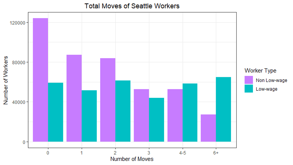
This graph shows total number of moves for low-wage vs non low-wage Seattle workers from 2010 - 2017. What we see is that low-wage Seattle workers have a greater number of total moves, being more likely to move 4+ times Of note, the common cut offs for defining high mobility/residential instability within the literature are three or four moves, so these preliminary findings show some indication of displacement that is worth further exploration.
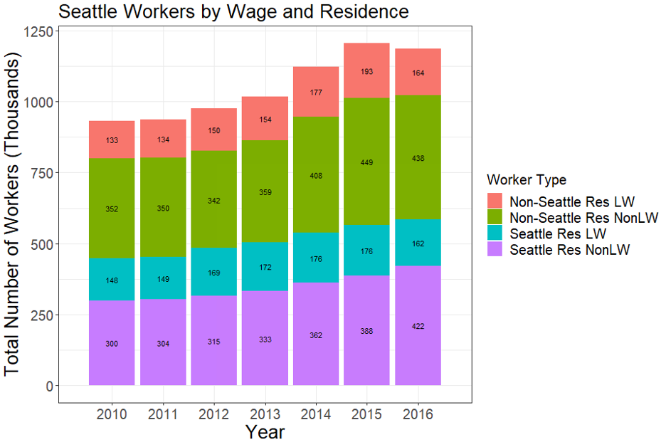
In attempting to understand change in residence of Seattle workers over time, this following graph looks at number of workers by wage status and residence. The key point to highlight here is that over time, the number of non-low wage workers living in Seattle (represented graphically in purple) increases over time, indicating a proportional decrease of low wage workers living in Seattle. This supports visualization that looked at where low-wage workers live over time (LINK), and demonstrated a decreasing proportion of low-wage workers living within Seattle over time, while increasing in the outkirts of the city. So again, we see some patterns indicating that low-wage workers are moving more frequently and more likely to move out of the city over time.